Put two cards on a table and they can look like twins: the same village street, the same delivery cart, the same boy squinting at the camera. One is a photograph printed on photographic paper from a negative. The other is a photograph reproduced in ink and run off by the thousand. The difference is not a matter of taste or snobbery. It changes how the card was made, how it ages, and what it is worth keeping for. And once you know where to look, it usually takes less than a minute to tell them apart.
Start with the surface, not the picture
Ignore the subject for a moment and look at how the image is built. A real photo postcard is a continuous-tone print: the tones are made of silver particles suspended in a gelatin layer, and they blend into one another without a pattern. Hold an 8x or 10x loupe to a flat grey area, such as a sky or a painted wall, and you will see a soft, slightly irregular grain. The edges of lettering in a shop sign will look smooth, sometimes a little soft.
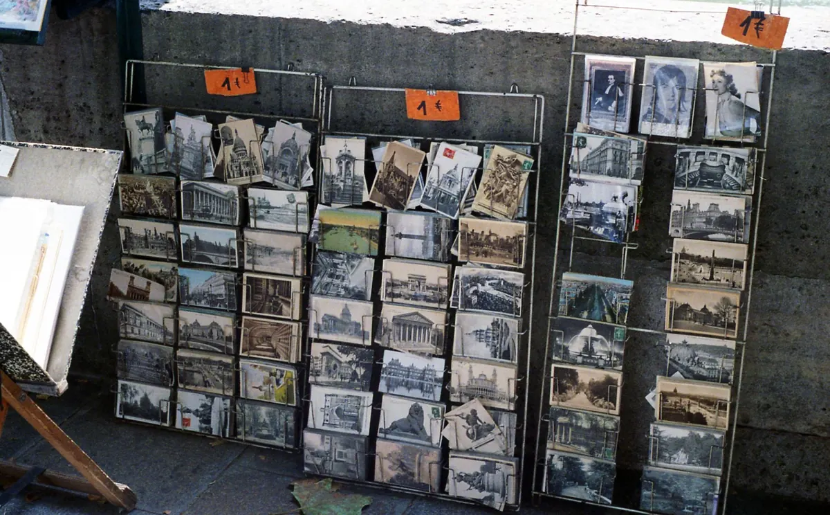
A mass-printed card is made of ink dots. Under the same loupe, a sky becomes a field of tiny dots in a regular grid, often at a slight angle so the screens for different colours form a rosette. Look at the boundary between two tones and you will see dots crossing the line. If the card is colour printed, individual dots of cyan, magenta, yellow and black are usually visible on skin tones and on any pale, even surface. This single test settles most cases.
Paper: weight, curl, and the way it catches light
The image side
Photographic paper has a coated layer that sits on top of the paper base, which gives real photo cards a faintly glassy depth, a sense of looking slightly into the surface rather than at it. Many are glossy; some are matte or textured, but the texture is part of the paper, not a printed imitation of one. Tilt the card under a lamp and the sheen should move across the image evenly.
The body of the card
Real photo cards are generally a little thicker and stiffer than ordinary printed cards of the same era, and they often hold a gentle, springy curl. Edges may be slightly uneven, since they were cut down from larger sheets, and some show a thin white margin where the negative ended. Mid-century printed cards went the other way: thin stock, a pronounced glossy coat, and later the woven linen texture that was pressed into the paper before printing.
Silver, sepia, and the chemistry of a photograph
Take the card to a window and tilt it against the light. In the darkest areas of a gelatin silver print you may see a faint metallic, mirror-like sheen. This is silvering, and it is a chemical signature rather than a printing effect. Printed cards do not do it; their shadows stay flat and matte, or they show ink texture instead.
Tone is a useful hint but never proof. Genuine photographs from the 1900s to the 1930s often sit in a warm brown-black or a purplish black, depending on the paper and how it was processed or toned. Hand-tinting was common on real photo cards: colour was applied with transparent dyes, watercolour or oils, so it tends to sit unevenly, stop short of a boundary, or be concentrated on faces and flowers. Printed colour from the same period is flatter and more uniform, and colour printed slightly out of register will show a faint coloured fringe along the edges of objects.
Clues inside the picture itself
Photographs carry the fingerprints of the camera and the darkroom. A box camera or a folding camera with a simple lens gives a particular falloff: sharp enough in the middle, softer at the corners, sometimes with a slight darkening at the edges. A contact print made from a negative laid directly on the paper may show the black border of the negative, a dome-shaped top, or the odd dust speck and scratch that repeat across a whole series by the same photographer.
One charming test is lettering. If the writing in the scene appears reversed, the print was made through the back of the negative, which happens with real photographic prints and is much rarer in commercial printing. Amateur framing is another good sign: a tilted horizon, a subject half out of frame, an unposed family group on a doorstep. Printed view cards were made to be tidy and saleable; real photo cards were often made because someone wanted the picture.
What the back can tell you
Turn the card over. Many real photo postcards were printed on paper manufactured for the purpose, and the small box where the stamp goes often carries the paper's brand name: AZO, Velox, Cyko, Artura, Kruxo and others. The presence of such a name in the stamp box is a strong indication that you are holding photographic paper.
Look also at how the card is laid out. Undivided backs, with the address space covering the whole side, belong to the earlier period; divided backs, with the message on the left and the address on the right, spread through Europe in the first years of the century and reached the United States from about 1907. Handwritten captions, a pencilled date, a photographer's stamp or a studio name on the back all fit the real photo story. On printed cards, the publisher's imprint and a series number usually appear neatly typeset on the front.
The printed card's usual giveaways
- A visible dot screen in skies, skin and flat walls under magnification.
- Uniform typeset captions, often with a publisher's name and number in the corner of the image.
- Colour that is flat and even, or misregistered at the edges of objects.
- Ink that has rubbed or flaked away, leaving clean white paper beneath.
- A pronounced manufactured texture, such as linen, or the very bright, saturated look of later chrome cards.
- Thin, flexible stock that shows no curl and no depth under the surface.
A five-minute routine that works
- Look at the picture with a loupe before you read a single word on it: dots or no dots.
- Tilt it against the light and check for silvering in the shadows.
- Weigh it in your hand and feel for stiffness and curl.
- Examine the edges for a negative border, uneven trimming or a white margin.
- Turn it over and read the stamp box, the layout and any handwriting.
Where to be careful, and what to do with what you find
Two exceptions are worth keeping in mind. High-quality photomechanical processes such as collotype can imitate continuous tone so well that a loupe is essential, and some real photo cards are copy prints made later from an earlier photograph, which are genuine photographs but not of the period they appear to show. Wear and tear cuts both ways as well: a crease, a bumped corner or a little foxing on a real photo card is normal and does not disqualify it, while a suspiciously crisp printed card with a perfect surface deserves a second look.
In the end, the label matters less than the picture. A handsome real photo card of a street that no longer exists, a face you cannot identify, a shop sign long painted over, has value as a document whether or not a dealer would call it a photograph. Learn the tests, use them quickly, and then let the image do the talking. The loupe stays in your pocket; the pleasure is in looking closely.
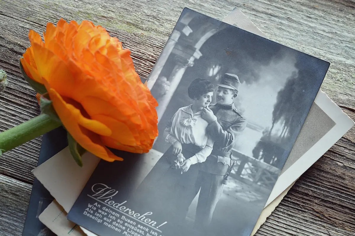
Photo: Pezibear / Pixabay